

March - August 2022
ABG
Developing a user-friendly portal for 50,000+ dealers, improving operations, and increasing sales in the paints industry through enhanced engagement.
This project involved designing and developing a premium D2C app & website for a prominent Indian conglomerate venturing into the hydroponics market. To prioritise a user-centric experience, we conducted in-depth research on global app trends and local grocery shopping behaviours. By analysing leading premium apps, we gleaned valuable insights that shaped the design of a desirable and high-end user experience. Our commitment to brand consistency extended beyond the app itself. We crafted a comprehensive style guide with a color palette that mirrored the client's products and packaging, ensuring a seamless brand experience across both the application and website.

Platform
Android & iOS
Timeline
March - August 2022
Role
UI / UX designer & researcher
Optimising interfaces
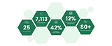
Leading user research across 10 centers in 4 zones—Mumbai, Pune, Satara, Chandigarh, Gurgaon, Kolkata, Jaipur, Hyderabad, Kurnool & Bangalore—I played a pivotal role in synthesizing data for key UX design decisions. Over 6 months, I created 600+ screens across multiple iterations. Post-business approval, I conducted user testing to refine the dealer experience, ensuring optimal usability. My multifaceted contributions shaped the project, integrating research insights into a seamless and user-friendly interface.

Business goals
Informed by heuristic analysis, competitive benchmarking, and input from both business and users, we iteratively refined the application's information architecture through multiple revisions.

HMW create a DMS tool that can
User goals


Initial low fidelity designs


Based on the implementation of design sprints and the creation of low-fidelity wireframes, we progressed towards the development of our application's design system. We created extensive design systems for web & mobile both


Final high fidelity designs
Around 600+ plus iterations led us to the end goal.
Low-fidelity sketches transformed into concrete plans!
With key user journeys mapped out for both app and website, we moved from wireframes to the exciting stage of fleshing out the core functionalities and interactions.
Seamless access for all paint needs
The login flow seamlessly integrates registration for interest, offering a fluid transition between retail and institutional profiles. It highlights the distinctive selling points (USPs) of the paint business, ensuring users are informed and engaged. This user-centric approach enhances accessibility and facilitates informed decision-making, optimizing the overall experience.

Navigating success: clear solutions for every dealer persona need
The landing page is designed with essential components to facilitate user navigation throughout the application. For new users, prominent categories are positioned at the top, facilitating exploration of diverse product types. Additionally, the landing page provides updates on active scheme statuses, order statuses, and detailed account information. This layout ensures a seamless experience for users, enabling efficient interaction with the application's features and functionalities, regardless of their familiarity with the platform.

Streamline your dealership with quick ordering
The ordering flow of this application prioritizes resolving critical dealer challenges by streamlining the order placement process amid high foot traffic in dealer shops. The product details page comprehensively encompasses essential information, including applicable schemes and key product features, catering to dealer requirements. Visual aids are strategically employed to enrich and condense information, facilitating quick comprehension. Categorization facilitates efficient product and SKU exploration, enhancing the shopping experience. Overall, the ordering flow optimizes speed, accessibility, and clarity, addressing dealer concerns and ensuring seamless transactions amidst bustling shop environments.

Quick and easy access to information in schemes
Schemes sections are meticulously designed for effortless access to a wealth of information. A thoughtful differentiation is achieved through varying font weights and colors, enhancing clarity and navigation through diverse content.


