March - August 2022
Natures Miracle
Elevated farm-to-table experience achieved through user-centric design, extensive user research, and meticulous style curation for a premium app and website offering fresh produce
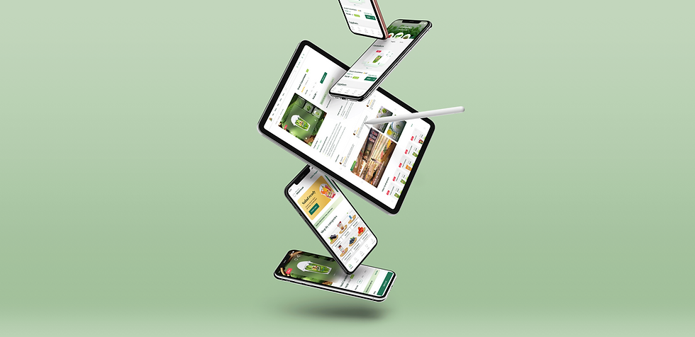
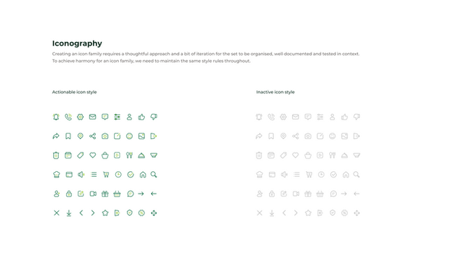
This project involved designing and developing a premium D2C app & website for a prominent Indian conglomerate venturing into the hydroponics market. To prioritise a user-centric experience, we conducted in-depth research on global app trends and local grocery shopping behaviours. By analysing leading premium apps, we gleaned valuable insights that shaped the design of a desirable and high-end user experience. Our commitment to brand consistency extended beyond the app itself. We crafted a comprehensive style guide with a color palette that mirrored the client's products and packaging, ensuring a seamless brand experience across both the application and website.

Platform
Android & iOS
Timeline
March - August 2022
Role
UI / UX designer & researcher

Key problem statements

Business goals
01
Enhance the new brand's visibility and engagement by expanding its presence across diverse platforms and connecting with a wider audience.
02
Craft exclusive premium experiences by meticulously designing unique features, ensuring top-tier quality, and delivering unparalleled service to encourage customers to stay.
03
Empower users to freely explore and experiment with our comprehensive range of products, fostering a dynamic and engaging experience that suits their preferences and needs
04
Educate users on cultivating a mindset aligned with our goal: sustainable hydroponic farming, disease-free practices, and accelerated growth for awareness and development.
Key takeaways from immersions
01 | They are evolved & mindful
Embracing conscious, ethical consumption. Prioritize brand visuals, storytelling. Build strong local brand affinity through flavor and ethical ingredients.
02 | Easy to please
Value-driven, prioritize comfort over cost. Frequent Top Up buyers for specific occasions. Order anytime, promotion-sensitive, weekend reminders. Personalized, human touch in ordering experience.
03 | Pro healthy living
Health-prevention mindset, portion control through calculated calories. Purchase veggies for 4-5 days, ensuring freshness. Eco-friendly packaging for sustainable, fresh deliveries.
04 | Method to the madness
Friday evenings preferred, late 10-11 pm last-minute slots. Weekdays, deliveries by 8 am for househelp prep. Flexible slots for convenience.
User goals
01
Users seek checkout optimisation, driven by limited payment options and concerns about shipping charges, emphasizing streamlined processes for convenience.
02
Ensure real-time stock updates, display products as "Out of Stock" just before payment, assure timely delivery, and offer flexible delivery slot choices.
03
Enhance refund/return process simplicity, address unresponsive customer care, and introduce a more personalized, human touch for improved customer satisfaction.
04
Place orders anytime, anywhere. Be promotion-sensitive, and implement a reminder system for weekend and Friday night purchases to boost engagement.
Initial designs
Explore my initial wireframes, mid-fidelity designs, and drafts. Each design underwent over 30 iterations, driven by factors like business shifts, pandemics, or enhancing user experience.
Organizational structure of the initial section on the landing page
Our aim was to empower users to discover products efficiently in the landing page's initial section, aligning with sustainability goals and educating about hydroponic farming. These initial designs were not selected due to unclear value proposition, cluttered layouts, and scalability issues.
Product details page
Enabling users to make mindful, healthy choices without overwhelming information, initial designs were rejected for inefficiency—occupying more space than needed. Striking a balance remains crucial for optimal user experience.

Product listing page
Our aim was to assist users in navigating and exploring products on the listing page, employing playful elements to make the exploration process enjoyable and engaging for them.


Final designs
Around 200+ plus iterations led us to the end goal.
Following the mobile screen finalization, we seamlessly extended the design to the website, crafting a versatile system. Throughout mobile screen design, the foresight of future adaptation into web screens guided us. This cohesive approach ensures a smooth transition, maintaining consistency and usability across different platforms.
Explore beyond grocery shoping
Our aim was to enable users to explore the various products our client offers from the get go from shopping via category to shopping by brand. We also enable the user to explore via the recipe corner , blogs & enable users to go beyond shopping.
For those who have lesser time on their hands we created the cards in such a manner that they can checkout directly from the landing page itself. We've also provided suitable spaces throughout to enable users to understand the brand since its a new one, & to explore it's various offerings

Inform users before loging in
Before login, we aimed to engage users with intriguing facts about hydroponic farming, fostering interest. This was achieved through informative splash screens highlighting the business's sustainability initiatives. Additionally, we ensured a straightforward and easy login process.

Empowering informed decision-making with essential information only
Embracing an image-centric approach, our design replicates the immersive feel of a local vegetable market. Ensuring users can easily purchase products throughout the portal, we introduced interactive elements for a gamified experience. Our clutter-free design enhances user focus on essential elements.

All rounded search
Our comprehensive search functionality seamlessly navigates products, brands, and recipes. Users enjoy an all-encompassing experience with the convenience of adding items directly from search results. Additionally, detailed filters are in place, empowering users to refine searches and find their ideal results effortlessly.


